*Borcelle Health, a company representing several large healthcare insurance plans, wanted to redesign their healthcare claim submission application using a new tech stack. While they were modernizing, they decided to improve the user experience in an effort to make the claim submission process easier and more accurate.
Sr. Software Engineer, Design Manager, Product Owner and Me
As the Senior User Experience Designer, I was responsible for the UX research, visual design, and interactive design.
UX Research Recruitment, UX Research Facilitation, Research Analysis and Synthesis, Prototyping, Usability Testing, and Design Hand-off.
Quick Claim decreased the average claim submission time by 50% and decreased claim rejections by 10%.
*Borcelle Health had an established feedback loop where users could comment on apps and rate their experience. This information was logged in splunk and used to discover new features, bugs and improvements. I created a splunk query to find pieces of feedback associated with claim submission.
Then, I placed all the feedback in AirTable and began an affinity mapping exercise by organizing similar pieces of information under tags. I also did some sentiment mapping.
I discovered very early on that users fell into two groups: providers who worked for large health systems that used the claim submission application only to correct rejected claims and small non-traditional providers who used it as their only means of getting reimbursed.
I met with the product manager and design manager to share what I had learned. Together, we decided to focus on the group of providers who used the claims submission application as their primary means of getting reimbursed and were non-traditional healthcare providers who regularly submitted a small number of repeatable healthcare claims for the same or similar services

Food delivery services, ride-share companies, taxi drivers, and salons were included in this group. From this filtered group of providers, I selected 10 local users to recruit for further research based on the level of detail provided in their feedback.
The team and I worked on a series of questions to ask users about their experience working as non-traditional providers and submitting healthcare claims. We then invited them to join us for user forum where we provided them with boxed lunches and gathered information. I facilitated the meeting as if it was a focus group.
What I learned in the focus group agreed with what I saw in the feedback. However, it allowed other members of the team to engage directly with users and added a human element for us to empathize with.
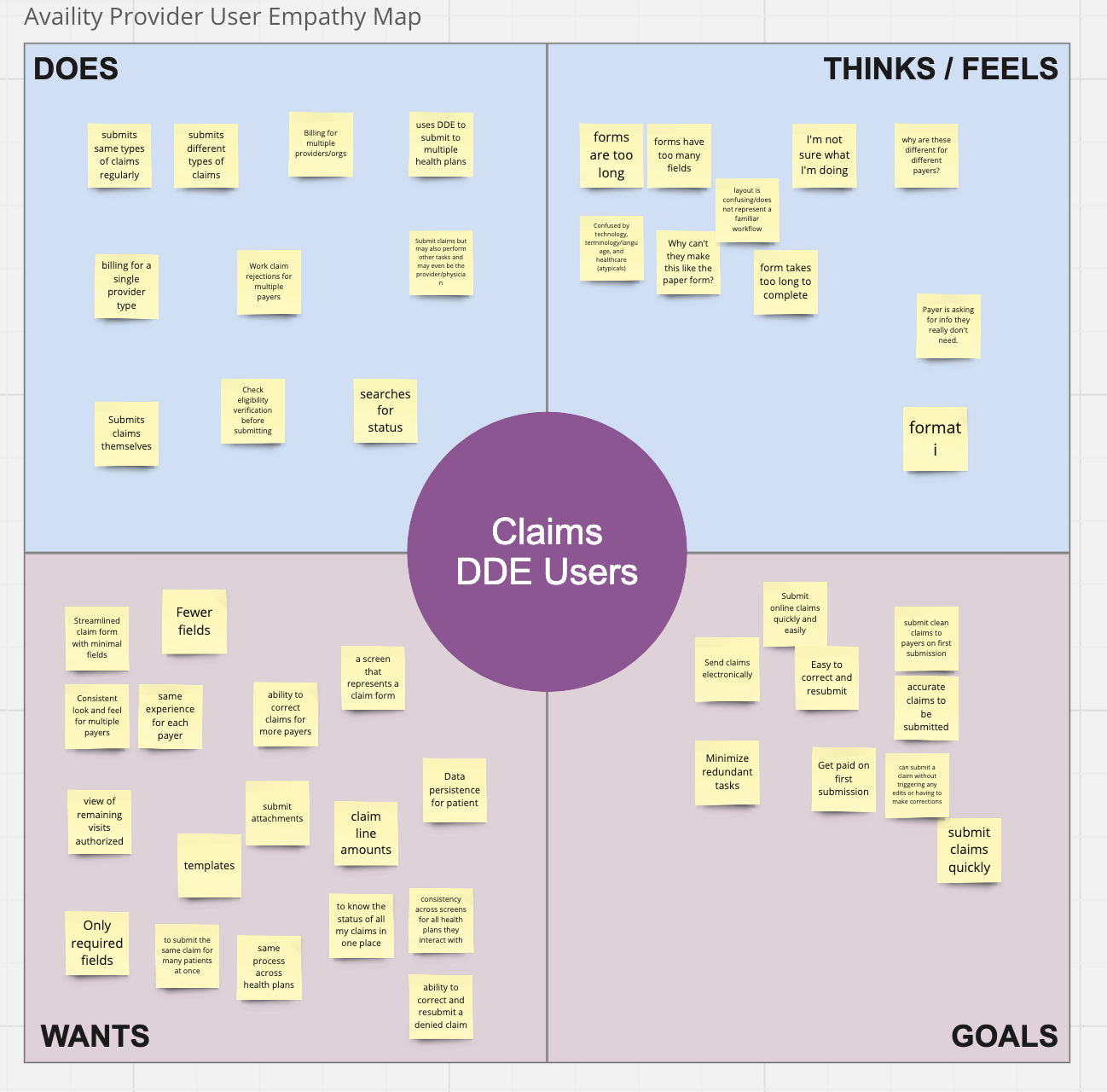
From the feedback ratings, we knew that 93% of providers were unhappy with the current claim submission application. Most of the users that we spoke with directly were also unhappy with their experience, but they could also voice why the were unhappy more effectively. Here are a few insights and quotes from the session:
Insight 1: Users expect elements of the submission form to pre-populate with information previously entered
Quote: "My information as a provider should populate, I shouldn't have to enter it every time"
Insight 2: Users want more time-saving features like auto-complete
Quote: "I should not have to fill out every detail that is on a claim form already! My time is valuable. With all the information required, there are more chances for errors. The application is out-dated and needs to use new technology!"
Insight 3: Users want the flexibility to save a claim and return to it later
Quote: "I would love to be able to save and work on a claim later. Sometimes, I may need to find a receipt to attach, and I need to walk away for a second."
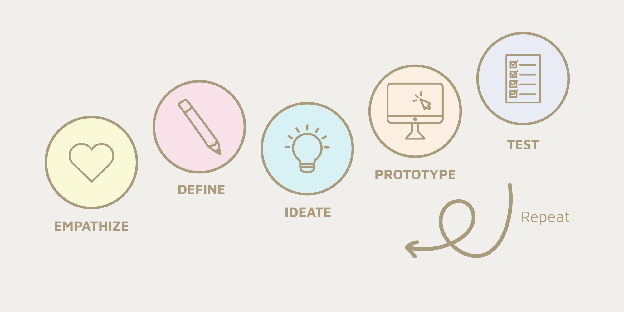
I facilitated and of discovery workshop with the team where we reviewed the themes from the feedback loop and the information gathered from the focus group and splunk. I led them in an empathy mapping exercise in order to help us better understand the needs, objectives and pain-points of the users.
I used this information to add new personas that represented the non-traditional healthcare providers. I also created a journey map illustrating what we had discussed as a team.
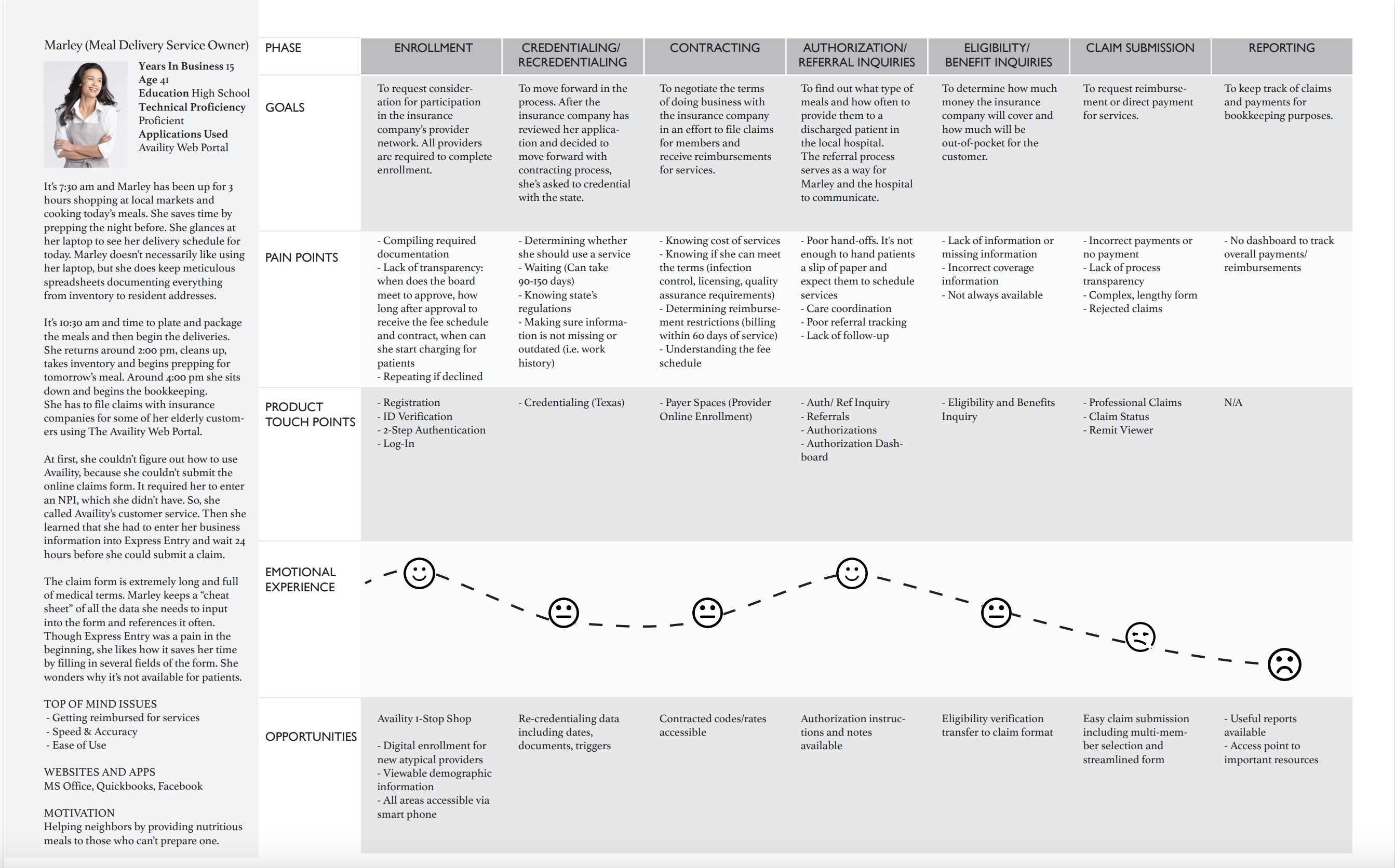
Then, I met with keystakeholders to review the journey map, and together we worked to identify the problem space, scope and objects for the effort.
Problem Statement
Non-traditional healthcare providers like ride-share companies, salons, carpentry companies and meal delivery services do not have the time to learn the complexities of healthcare. They simply need an easy and accurate way to get paid for the work that they do.
Create an experience that is:
I coordinated with the product owner, the developer and engineer to get an understanding of what was feasible in the new technology stack. We mapped out the old workflow that users had to follow to submit claims. Then, together, we worked on ideas for a new one.
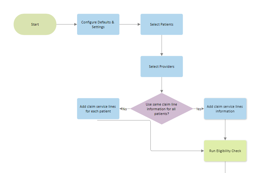
I used Adobe Illustrator to quickly create wireframes to illustrate some of the screens we identified in the workflow. There was a desire to make sure that this application worked well on tablets as well as traditional laptops, so I was careful to layout ideas with that in mind.
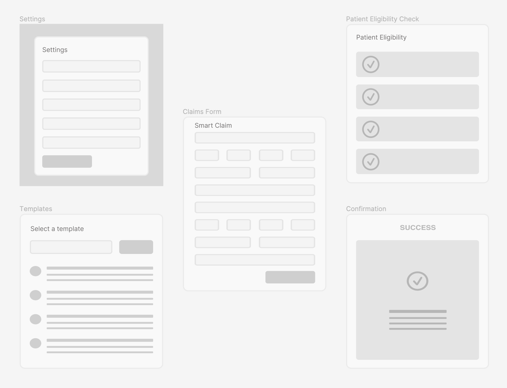
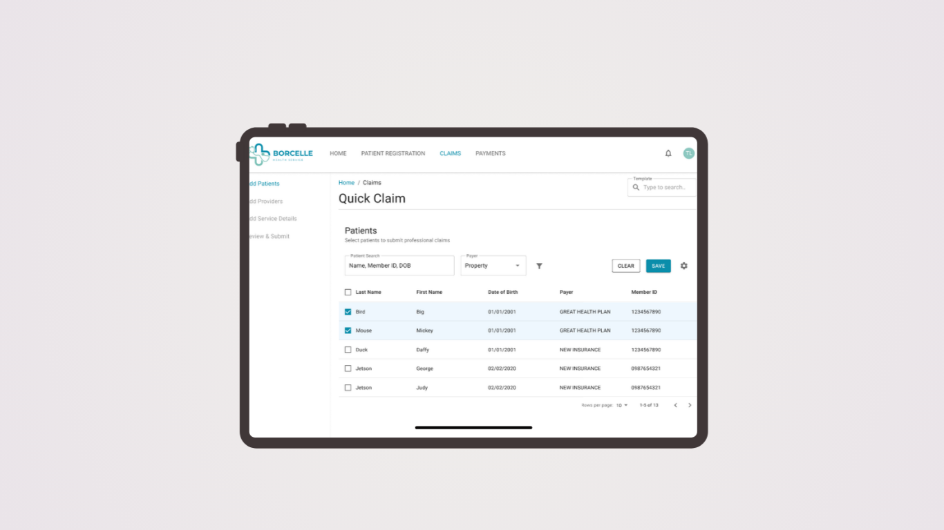
Once I had the general idea of the flow and screens needed for the experience, I switched over to Figma to work on high-fidelity mockups. I find that starting mockups in the same tool that I will be using for protoypes saves a lot of time and energy.
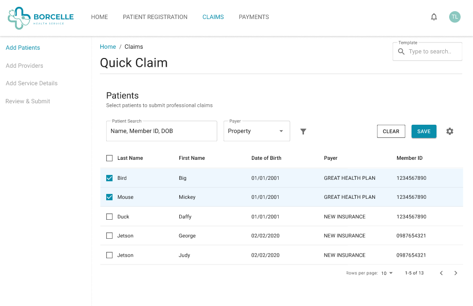
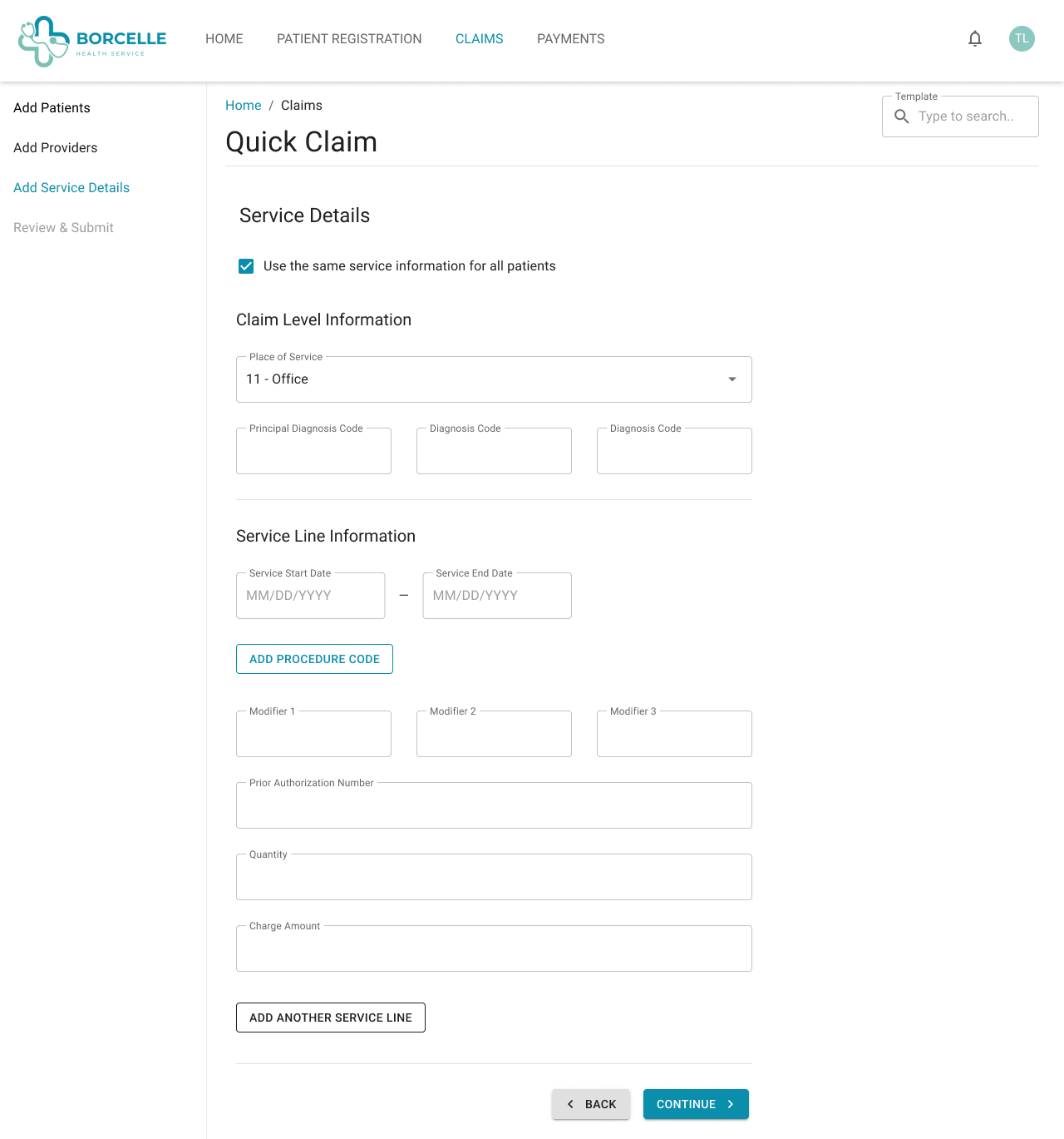
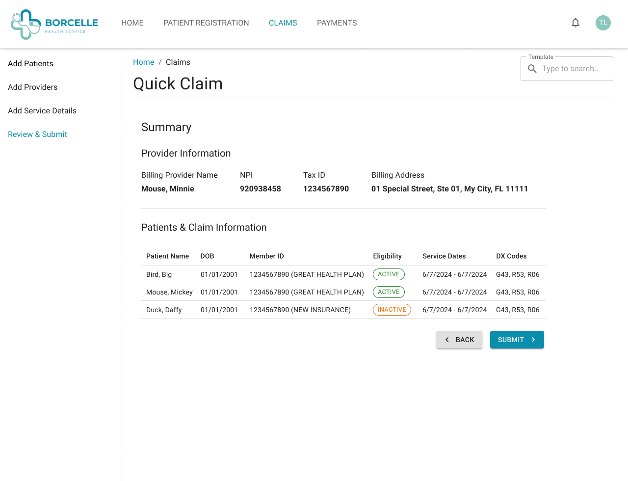
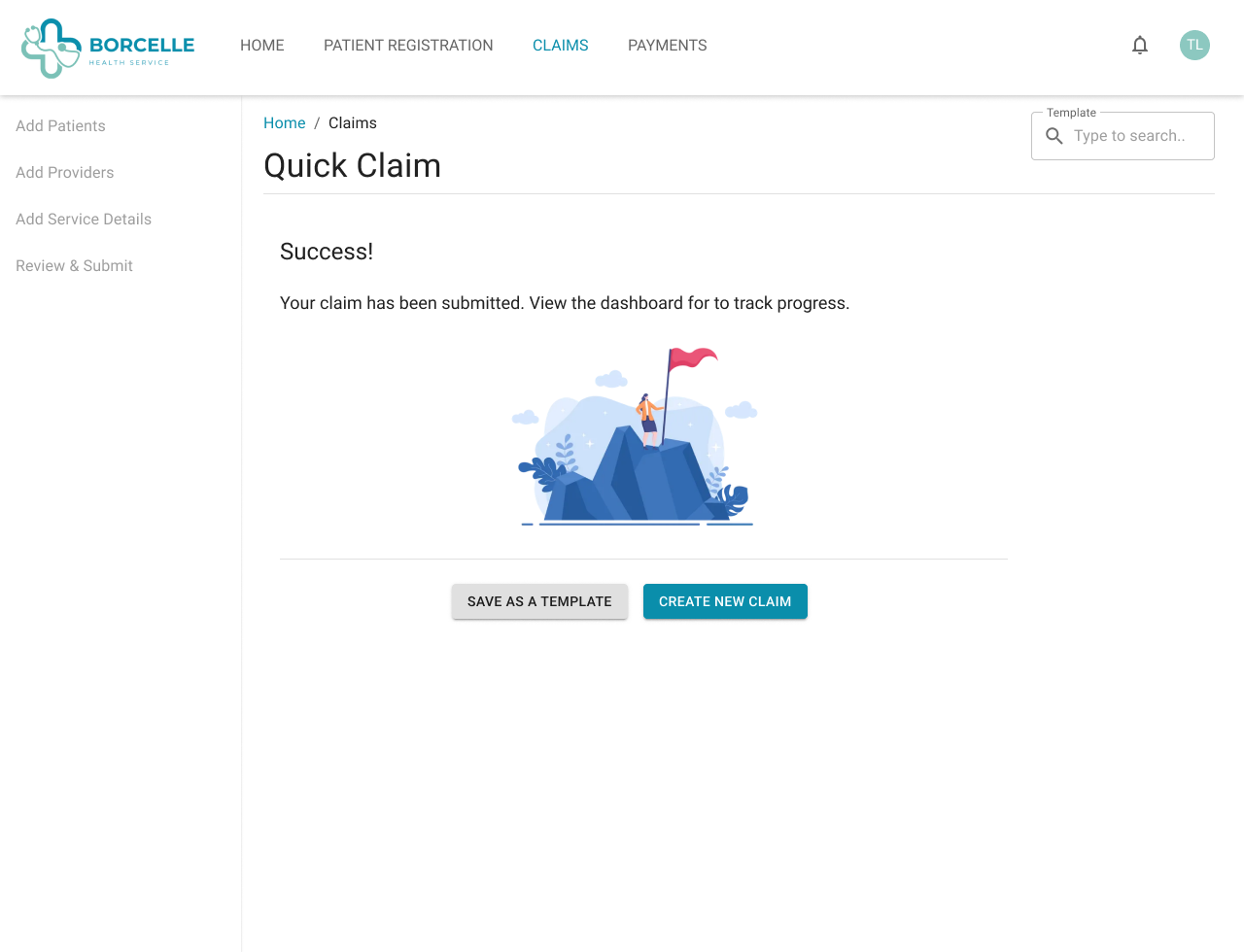
The working prototype was done in Figma. I wanted a fully interactive experience for usability testing with users.
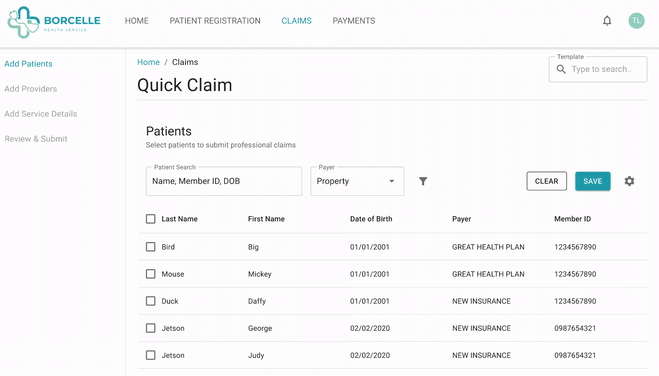
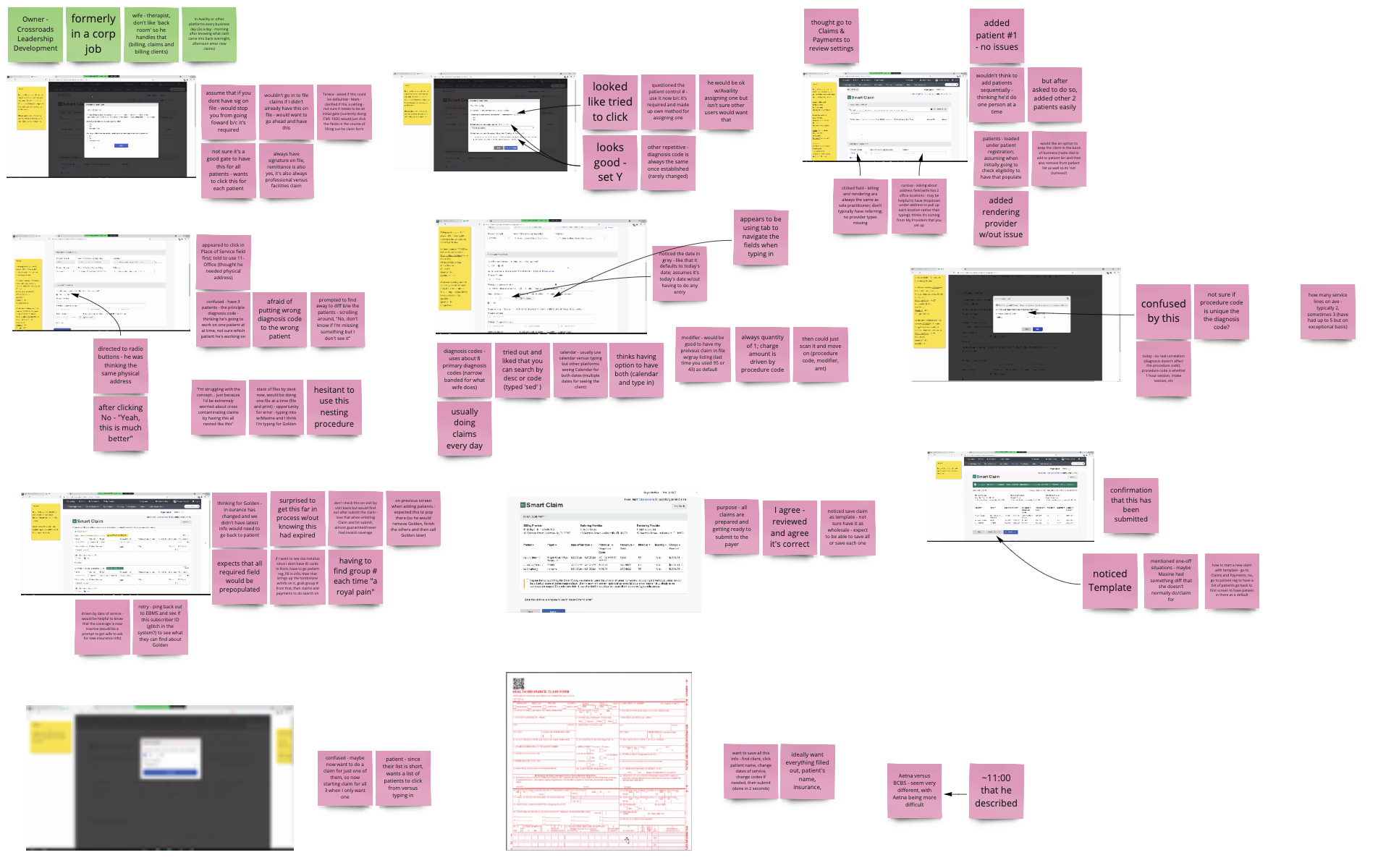
I reached back out to the providers from our forum and asked if they would allow me to observe them as they entered in a claim using the current system. Then, I asked them to enter the same claim using the prototype. I recorded their screens using ScreenPal and made notes in miro.
The providers were eager to provide feedback and even suggested more bulk functions that we could add to improve their workflow.
Flexibility is key. Many different kinds of providers want to submit claims in a way that makes sense to them. Allowing for flexibility in the workflow and the ability to save and return was important for all users.
*Note: To comply with my non-disclosure agreement, I have replaced the name of my previous employer with Health+ and have omitted and obfuscated confidential information in this case study. All information in this case study is my own and does not necessarily reflect the views of my previous employer.