Availity, LLC

Essentials Dashboard
UX Case Study

Product Overview

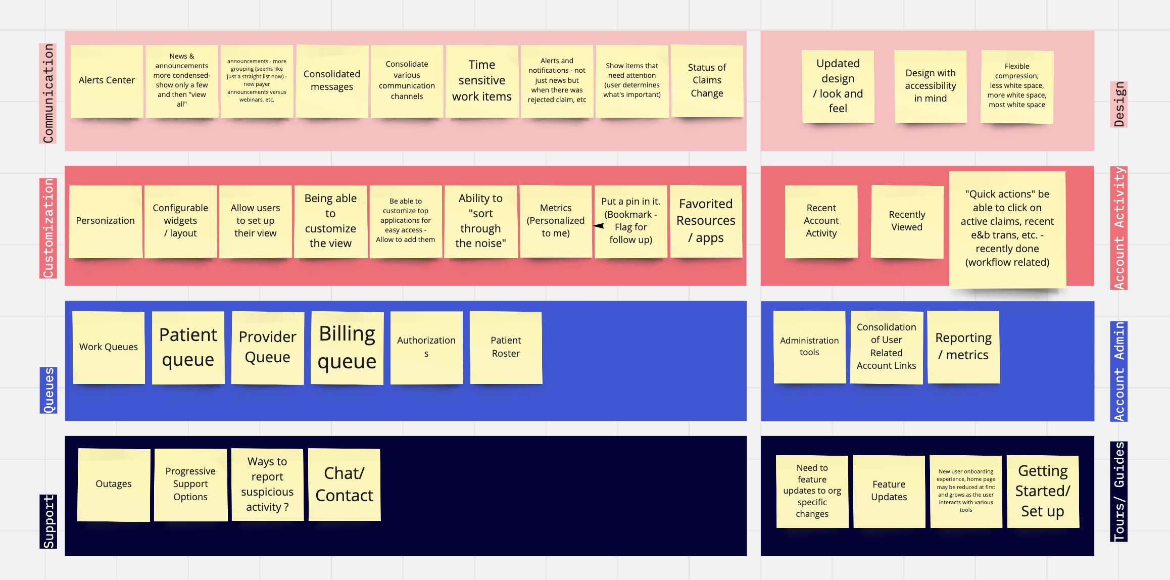
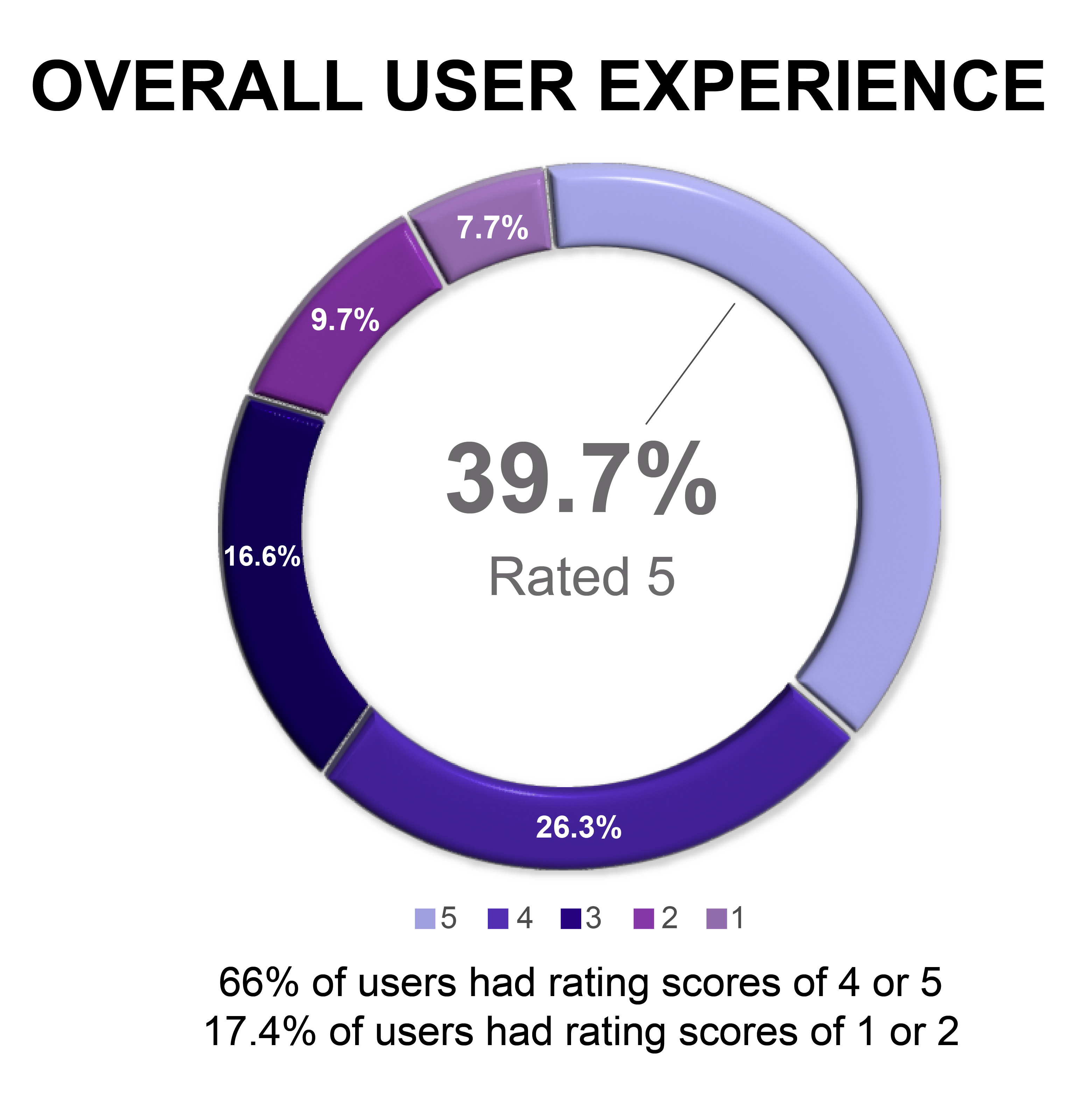
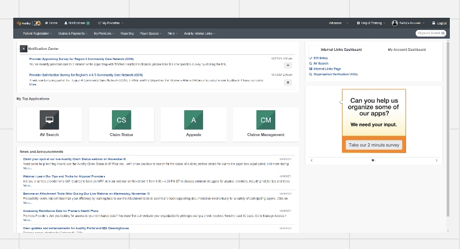
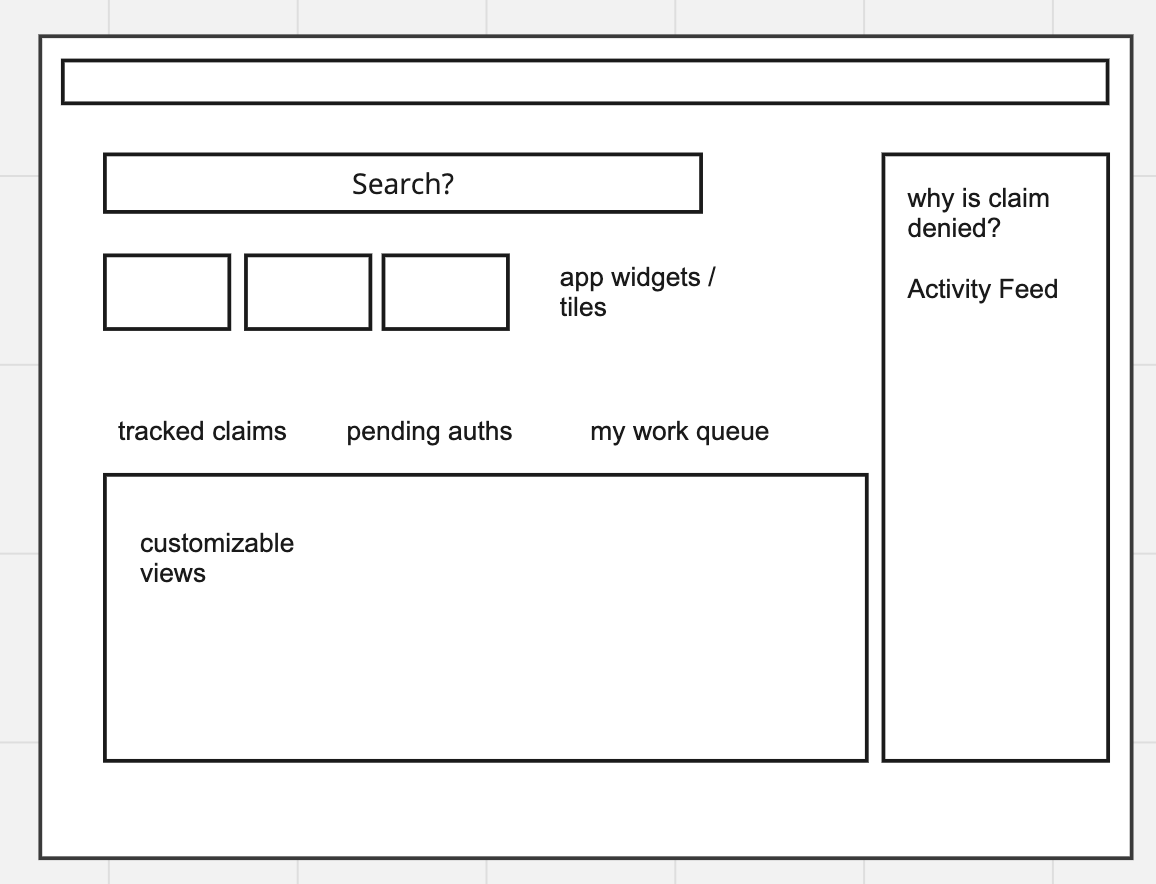
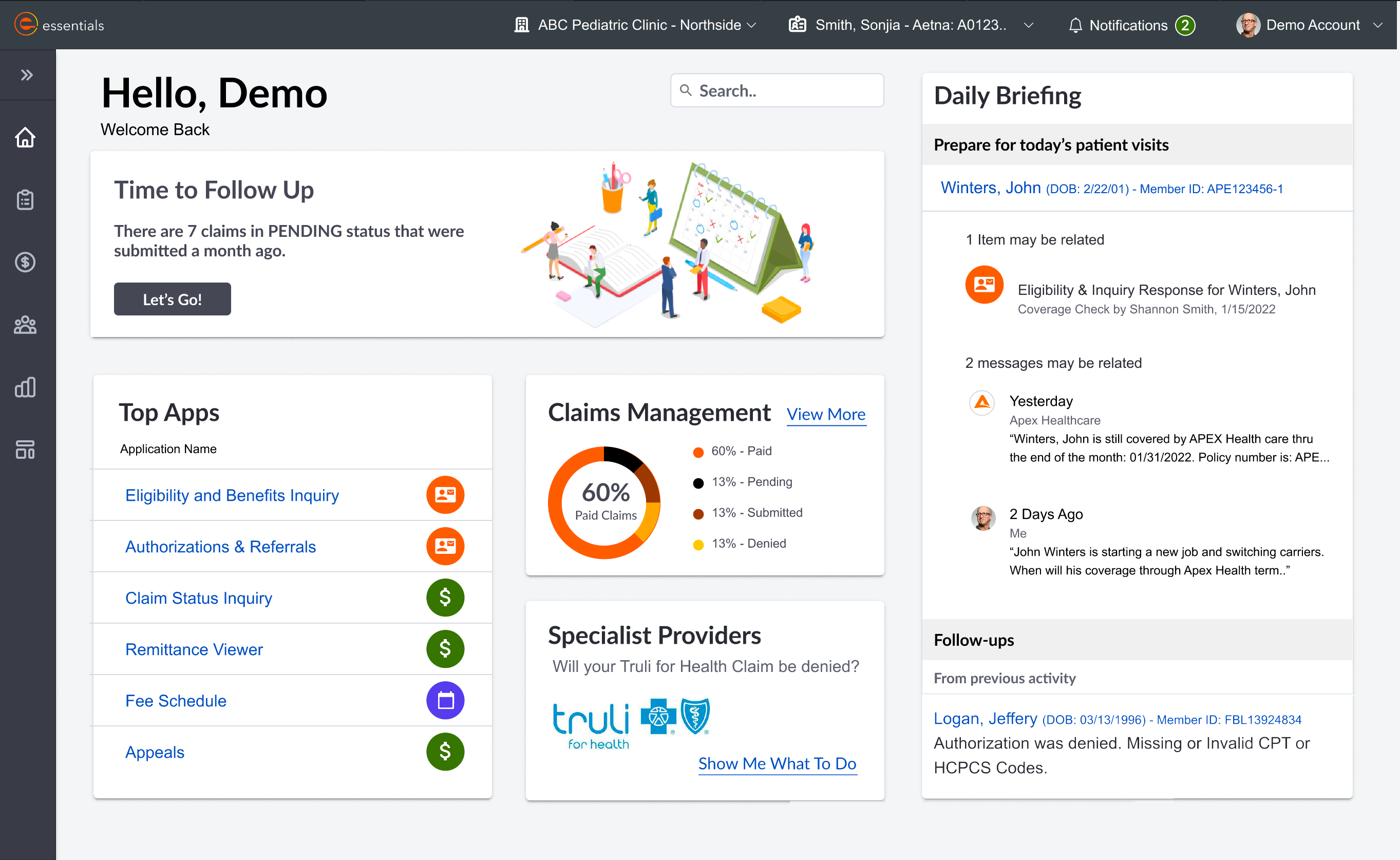
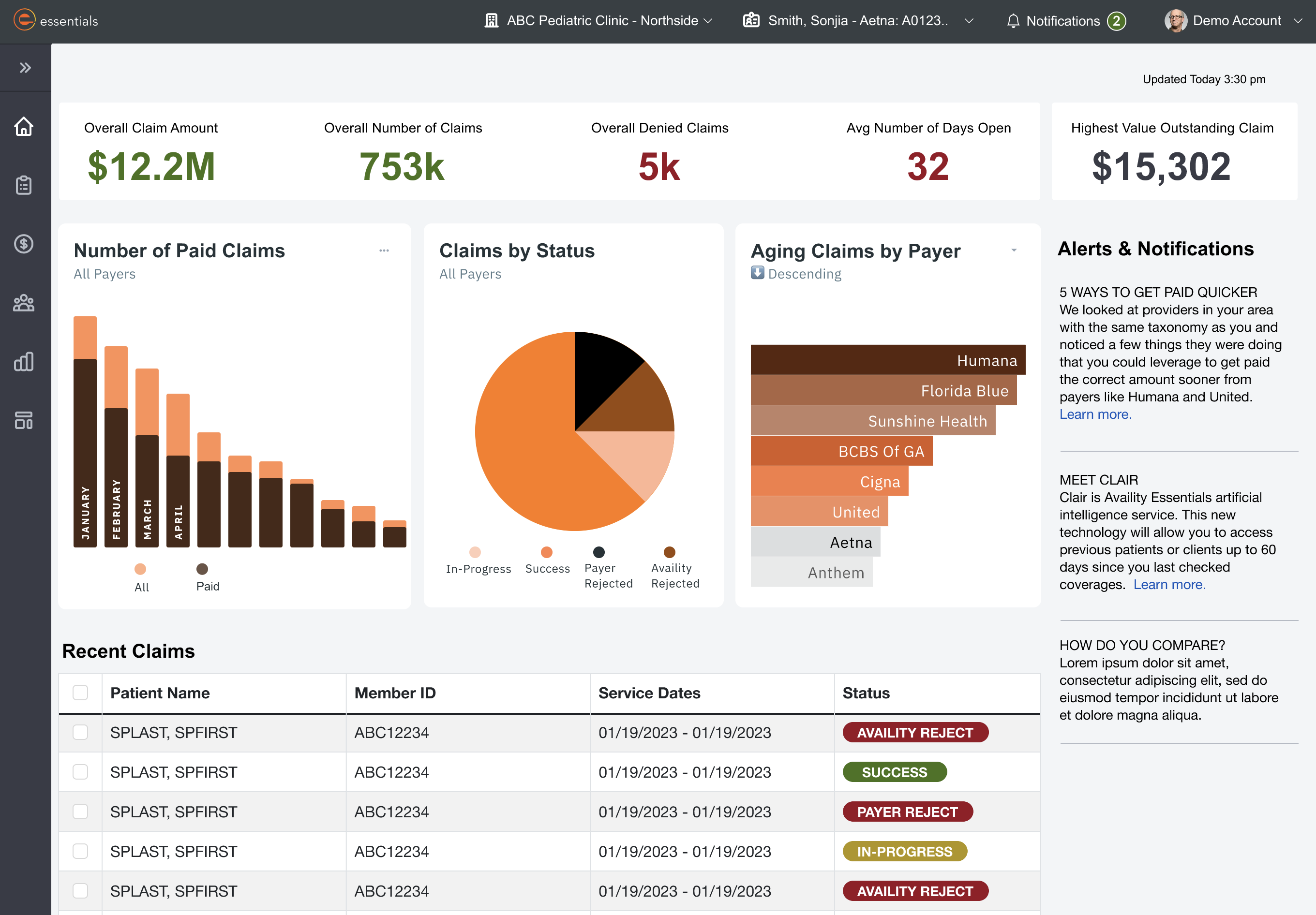
The Essentials dashboard serves as the home screen of the Essentials platform and the initial communication center for users. Through feedback and analytics, we saw that the dashboard's engagement was extremely low, and the communication channels were not effective.

The dashboard's UX needed to be optimized to allow for customization for different types of users. The communications needed to be streamlined, and support channels needed to be reimagined.

Project Duration

3 months

My Role

Senior UX Designer

Tools

mirofigma

My Process

Design Thinking


Empathize

Define

Ideate

Design

Test

Empathize

Problem Statement

How might we make the Essentials dashboard more relevant and useful to meet the needs of all our different users, and add value by modenizing our tech stack to enable more features.

Objective & Goals

Improve Communications

  • Alerts should be timely and actionable
  • News and announcements should be relevant
  • Updates in status should be clear and easy to find

Enable Customization

  • Dashboard components and graphs should be configurable
  • Components should be removable
  • Irrelevant messages can be silenced
  • Important items can be flagged for later
  • Most used options should be favored
  • Graphs and charts should leverage user data

Establish Task Lists to Increase Efficiency
Users should be able to select how they want to work. Provide:

  • Patient-centric view of tasks for each patient
  • Billing view of tasks for claims and payments
  • Provider view of tasks for provider directories

Create Effective Help and Support Channels

  • System outabes should be displayed
  • Progressive support should be available
  • Reporting suspicious account activity should be easy to do
  • AI powered chat should be available
Notes from stakeholder interviews

Stakeholder interview notes where they outline their goals. (Miro)

Target Audience

The complex part about designing this dashboard is that it had to be effective for multiple types of organization and personas. We decided to focus on two opposing types of organizations to start.

  1. Large organizations with over 50 users, servicing over 100 providers with the ability to integrate some of Essentials' functionality with their internal billing software. An example of this type of organization would be a large chain of medical clinics.
  2. Very small atypical healthcare providers. This company usually has less than two employees, no healthcare experience and no internal medical billing software. An example of this type of organization would be a caterer who delivers nutritious meals to the elderly and is reimbursed by medicare or medicaid.

From there, we identified two personas that were responsible for some of the same billing tasks: Paula, the practice administrator for the large health clinic and Marly, the owner of the catering/ meal delivery organization.

Paula's Persona
Marlys Persona

Define

Discovery Questions

  1. Is there a difference in the needs of smaller and larger organizations?
  2. What are the needs of users and how can the dashboard accommodate them better?
  3. If we were forced to choose one audience to design for, who should we focus on?
  4. How can we incorporate Artificial Intelligence?

User Quantitative and Qualitative Feedback

We launced a GainSight survey to gather over all user sentiment about the current dashboard.

survey results
survey graph

We spoke to power users who handled claims and payments for large clinics, like Paula. We found that their needs were dynamic. We recorded these needs in Miro.

Paula's needs

Ideate

We focused our ideation sessions to dig deeper into the task lists and progressive support.

The Checklist should help both Paula and Marly with:

  • Accurate data entry for patient information
  • Selecting the correct codes for procedures and services
  • Remediating rejected and denied claims
  • Verifying insurances
  • Reducing denied claims
  • Taking advantage of value based practices
checklist

Inspiration

checklist inspiration

Design

Feedback from users really impacted the design. The users did not like a lot of change, because they are measured by their productivity. When things are moved around or changed, they have to take time away from tasks to learn a new system. Knowing this, I tried to work within the information flow of the old dashboard.

Old Dashboard

Old Dashboard

Low Fidelity Wireframe (Content Flow)

wireframe

Dashboard

Essentials Dashboard

Claims Dashboard

Test

We created a beta version and piloted it with a very small group of users. We set pilot goals and they were successfully met. In fact, we received only 6% negative feedback from users.

Pilot Results

Pilot Results

Results & Take Aways

In the end, Availity decided to postpone the launch of the new dashboard and go a different direction. However, I learned a lot of great things from this project.

Lessons Learned

  • Users are resistent to change. The more information we can provide ahead of time to users the better. Also, little contextual guides, tips and tricks in the UI lessens the learning curve.
  • The defaults matter. I've heard that 90% of users stick with the default settings and even with a highly configurable dashboard we saw the same pattern of behavior. Nailing down what is most important to users to initially show is key.
  • Personalization costs! It can cost in performance, in development hours, and in data minig and storage. We had to make some trade-offs to accommodate the rising cost of personalizing different aspects of the dashboard.