*Health+, a company representing several large healthcare insurance plans, wanted to empower providers who were using their suite of tools by creating a way for to manage real-time notifications about changes in patients' coverage, claims or authorizations.
Timeframe: October 2018–September 2019
UI Developer, Sr. Software Engineer, UX Designer, UX Writer, Product Manager and Me
As the Senior User Experience Designer, I was responsible for all UX research activities including creating the research plan, recruiting, testing, synthesizing data and reporting out to senior leadership. I also led the visual and interaction design efforts.
UX Generative Research, Visual and Interactive Design, Prototyping, Usability Testing, and Presenting
The introduction of a notification settings application increased user engagement by 135%
*Health+ had an established feedback loop where users could comment on and even rate features. I combed through 6 months of comments and identified users who mentioned notifications.
In addition to the feedback loop, *Health+ had a robust service desk with issue tracking in Salesforce. I worked with the service desk manager to get a report of all tickets associated with notifications from the past 6 months.
I used both of these channels to generate a list of users to recruit for UX research.
The research methods I used to gather information were user interviews and surveys. I used Calendly to schedule user interviews, and I conducted them on Zoom. My counterpart and I captured our notes in Mural.
Additionally, I created a survey in Qualtrics and sent it to users that we couldn't schedule for interviews. After reviewing the recordings and survey results, my counterpart and I did an affinity mapping exercise to help synthesize pain-points.
One of the first things we noticed was that 76% of users wanted to have more control over notifications.
Users wanted to control what they received notifications about, when they received notifications and who they received notifications from.

I facilitated a discovery workshop with key stakeholders where we presented our early research findings. I used the 5 Whys Exercise to help us as we reviewed the findings, so that we were addressing the real problems and not just the symptoms. We settled on the following problems:
Problem 1: Users have to log in to view updates in their notification center. Healthcare providers are busy treating patients and need flexible ways to be contacted about updates.
Problem 2: Users were being notified about things that they were not interested in. Some only wanted to be notified if a claim was denied and not if it was paid.
Problem 3: Users were receiving notifications too late or too often. They had no control over the frequency of notifications.
Design an aesthetically pleasing experience that empowers providers to quickly and easily take control of their communication preferences, leading to greater user satisfaction, increased engagement and increased productivity.
I facilitated a two-day cross-functional ideation workshop where the team did brainwriting exercises to come up with as many ideas as possible. We then prioritized the ideas using the Now, Next, and Future framework.

After agreeing on scope, we worked together as a team to whiteboard out a few ideas and to discuss the workflow and APIs.
In the days following the ideation workshop, I started translating some of our ideas into artifacts so that we could discuss further as a team. I started by creating a workflow diagram to represent how we would like the notification settings to work.

"I experience things by drawing them." -Eleanor Dickinson
I sketched out a few of the ideas from the workshop in greater detail using pen and paper. I paid close attention to the information architecture as I considered things like navigation.
Because the notification settings was folding into an existing suite of tools, I had to figure out where it should live and how users would get to it. I did a few card sorting exercises with users to determine what made the most sense. We landed on adding it to what was just a user profile area, which we expanded and redesigned to incorporate notification settings.

I used Axure RP to create a series of mockups that would be used for testing. I created two versions of the design. One version had switch controls instead of checkboxes to toggle on and off settings.
The mockups below show the version with checkboxes.

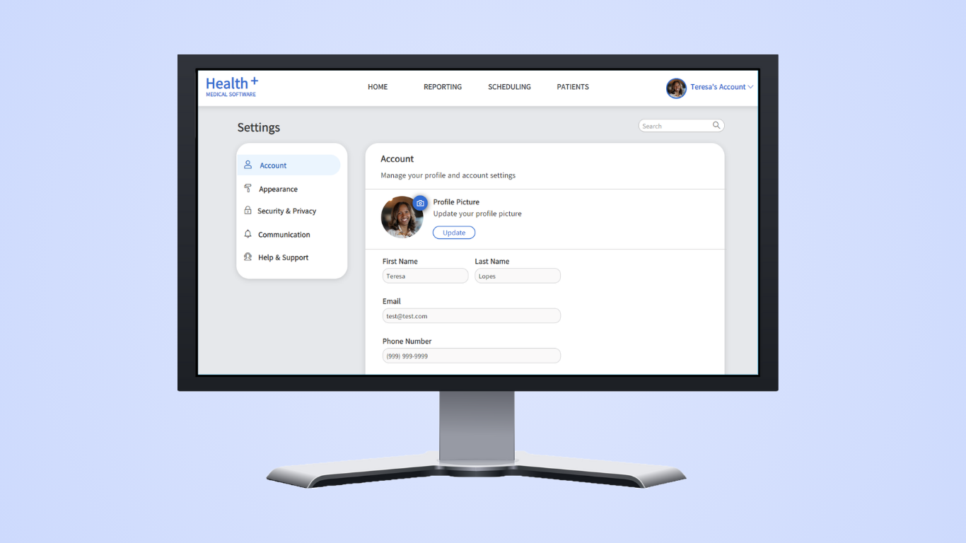
The old profile page had to be redesigned and renamed to accommodate settings. A menu was added for navigation to notification settings.

After a notification trigger is selected, users can identify their preferred communication method and frequency.

A new notification settings page was added with selections for different triggers.
The high fidelity mockups were converted into working prototypes in Axure RP. I created two libraries to help with this effort. The first library was a component library and the second was a style library that held a lot of the color and font information.
Zeplin was used to generate HTML and CSS from the prototype for development.
Two prototypes were created for A/B Testing, because we wanted to introduce a new control to the existing suite of tools. Switches were used to toggle on and off settings in one prototype and checkboxes were used in the other.
Spoiler Alert: The checkbox out-performed the switch (see the test section for details).

As mentioned earlier, the team drew inspiration from iPhone settings and wanted to introduce a switch control to toggle on and off settings. However, switches did not appear anywhere else in the UI for the *Health+ suite of tools.
To quickly test this idea, I created a script with a task to enable a setting. I added a HotJar plugin to each prototype that would record user behavior and create heatmaps. Then I ran an unmoderated A/B test to determine whether to use checkboxes or switches. The control group used checkboxes while the variable used switches. I surveyed approximately 379 users over a 7 day period, which met my statistical significance criteria at 90% confidence level. Both options performed well, but I found that checkboxes were slightly better.

I returned to the initial of users that I recruited from feedback loops and service desk tickets. I asked them if they were interested in participating in a usability study and was able to schedule with 20 users. The usability study was approximately 30 minutes long. In the first 15 minutes, users were asked to accomplish tasks using the prototype. In the second half, users were asked for their feedback. I then used the feedback from these studies to make iterations to the design prior to handing it off to developers.
Even the best designs need time to grow on users. After releasing the updates to the profile area to accommodate notification settings, users complained about being disoriented. We should've communicated with them more prior to releasing the app.
*Note: To comply with my non-disclosure agreement, I have replaced the name of my previous employer with Health+ and have omitted and obfuscated confidential information in this case study. All information in this case study is my own and does not necessarily reflect the views of my previous employer.