*Health+, a company representing several large healthcare insurance plans, established a cross-functional innovation team with the objective of making the patient check-in process easier, more efficient and more transparent.
Timeframe: April–October 2020
UI Developer, Associate Designer, Cloud Architect, Data Scientist, Product Manager and Me
As the Senior User Experience Designer, I led the discovery and early design phases utilizing design thinking and strategy frameworks.
UX Research, Visual and Interactive Design, Prototyping, Usability Testing, Design System Management, and Accessibility
We decreased the time providers spent locating patient benefit information during check-in by 90% while decreasing the amount of paperwork patients had to provide.
I worked with the data scientist to identify a list of patients, providers and health plan representatives - the humans powering the check-in process - to interview.
Due to covid-19 restrictions, most of the interviews were conducted on Zoom. However, I spoke with and observed people when I was visiting healthcare providers in my personal time.
Insights were captured in Miro during interviews and later moved to MS Excel for synthesis. Early on, we recognized that there was a large burden on patients to bring everything necessary for a successful check-in, because healthcare providers of all sizes, from hospitals to clinics, had limited access to patient information.
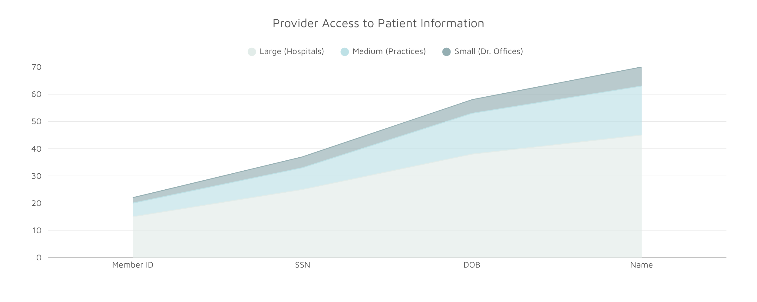
Smaller providers had more access to patient information due to the fact that they saw patients on more of a reoccurring basis. This allowed them to temporarily store demographic data that could be used for future check-ins.
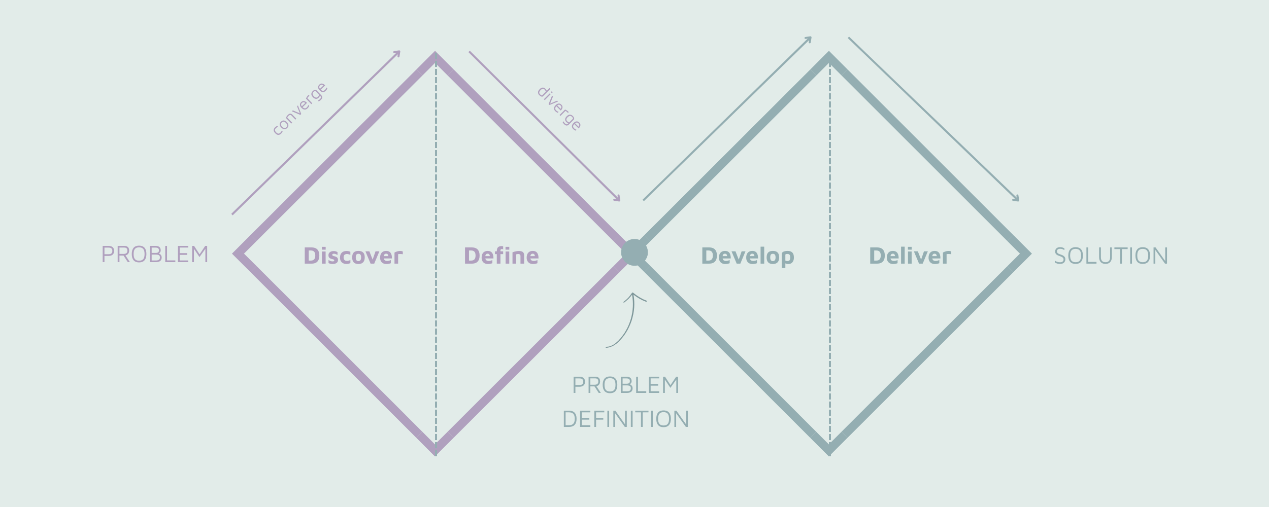
I found leveraging the Jobs To Be Done (JTBD) framework helped me to organize the user interview insights in a way that resonated with leadership.
I facilitated an End of Discovery workshop where the team and I reviewed the insights, JTBDs and journey maps. I then used the How Might We (HMW) framework to help us craft our project's problem statement.
How might we make it easier to locate the right patients during check-in and view insurance benefits quickly, accurately and efficiently?
With the focus of the project defined, we reviewed the insights to see which ones met the agreed-upon scope. I then worked with the team to prioritize the insights using an Effort Impact matrix.
"How is always less important than why." - Dean Koontz
In order to improve how providers search for patient information during check-in, I had to figure out why they were searching in the first place. There were three main reasons:
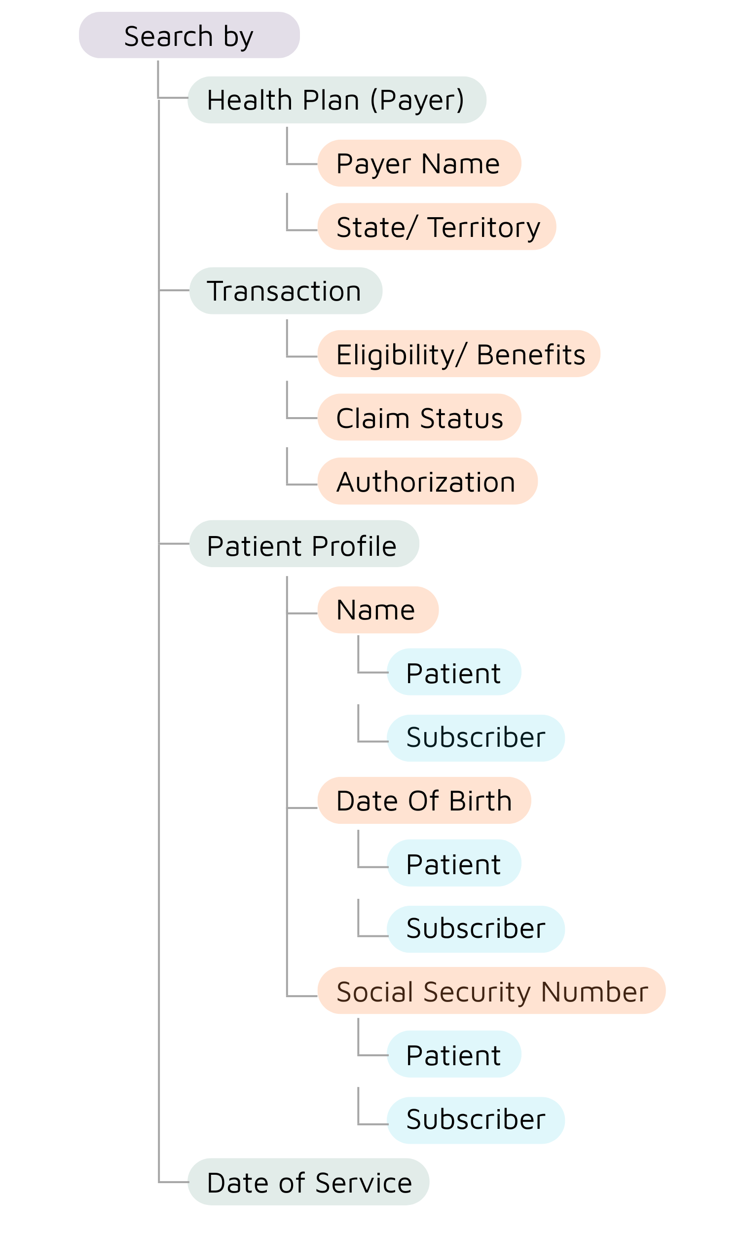
I used a card sorting exercise with providers to help me determine what information was necessary for each scenario. Armed with this, I was able to figure out some of the filtering and sorting criteria.
I used the 6-8-5 sketching method using pen and paper to rapidly explore ideas. After the 5 minutes, I reviewed the sketches with the team an we decided on the most promising solutions to try to refine further.
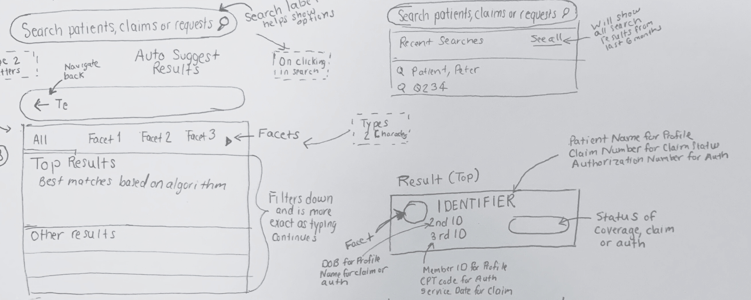
I used Figma to translate sketches into working wireframes and even performed usability testing using them. Instead of jumping into high fidelity mockups, I decided to work with wireframes as long as I could. Idowu Koyenikan says, "Where your attention goes, your time goes.
In this phase of the project, I wanted to spend the most time and energy ensuring that the information architecture and interactions made sense to users.
I also wanted the users to pay attention to the interactions and information architecture. Testing on wireframes allowed me to do just that.

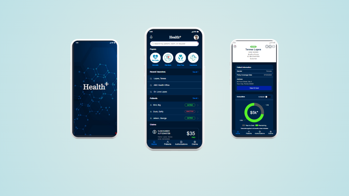
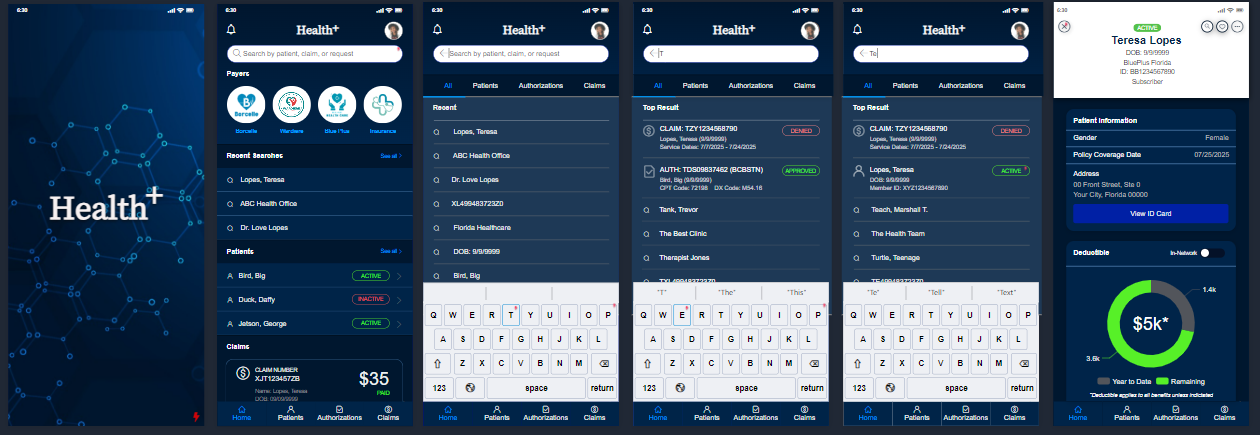
We did early usability testing on both wireframes and high-fidelity mockups. I wrote a script with a scenario asking users to find a patient and verify that the patient had active insurance using the search feature and patient profile.
During the sessions, I observed that several users formatted dates differently. Some used yyyy-mm-dd others just mm/dd/yyyy. There were a lot of combinations that had to be resepected while searching. Also, some users liked to separate search items with a comma and others with a space.
On the patient profile, the status needed to have more affordance than other pieces of information. I decided to place it near the top of the screen in a badge to draw the eyes directly to it.
"The original is unfaithful to the translation." – Jorge Luis Borges
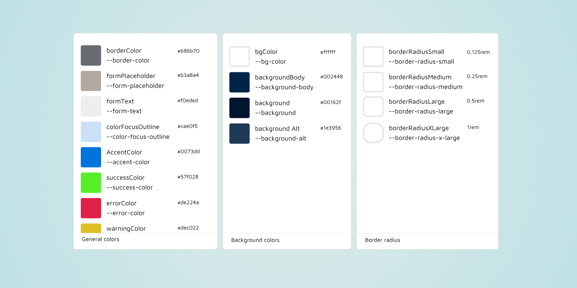
I translated the mockups into a prototype developed in Figma and introduced Figma's dev mode to the team. This allowed them to directly view the html and css within Figma without using an outside tool like Zeplin to decompile the design. Additionally, I worked with developers to create a few components for our newly established design system. I also helped with the creation of semantic design tokens that could be accessed within Figma. I used zeroheight for the design system documentation.
Lastly, I served as an accessibility SME when creating the design for components ensuring sizes, interactions and colors met WCAG 2.1 AA standards. When the components were coded, I also checked them using automated tools like the Level Access Access Assistant and WAVE. Then I did manual testing using the Trusted Tester methodology, NVDA and the ANDI tool.
When working on an innovation project with very tight deadlines, it is important to identify the right problems to solve and the proper scope.
*Note: To comply with my non-disclosure agreement, I have replaced the name of my previous employer with Health+ and have omitted and obfuscated confidential information in this case study. All information in this case study is my own and does not necessarily reflect the views of my previous employer.