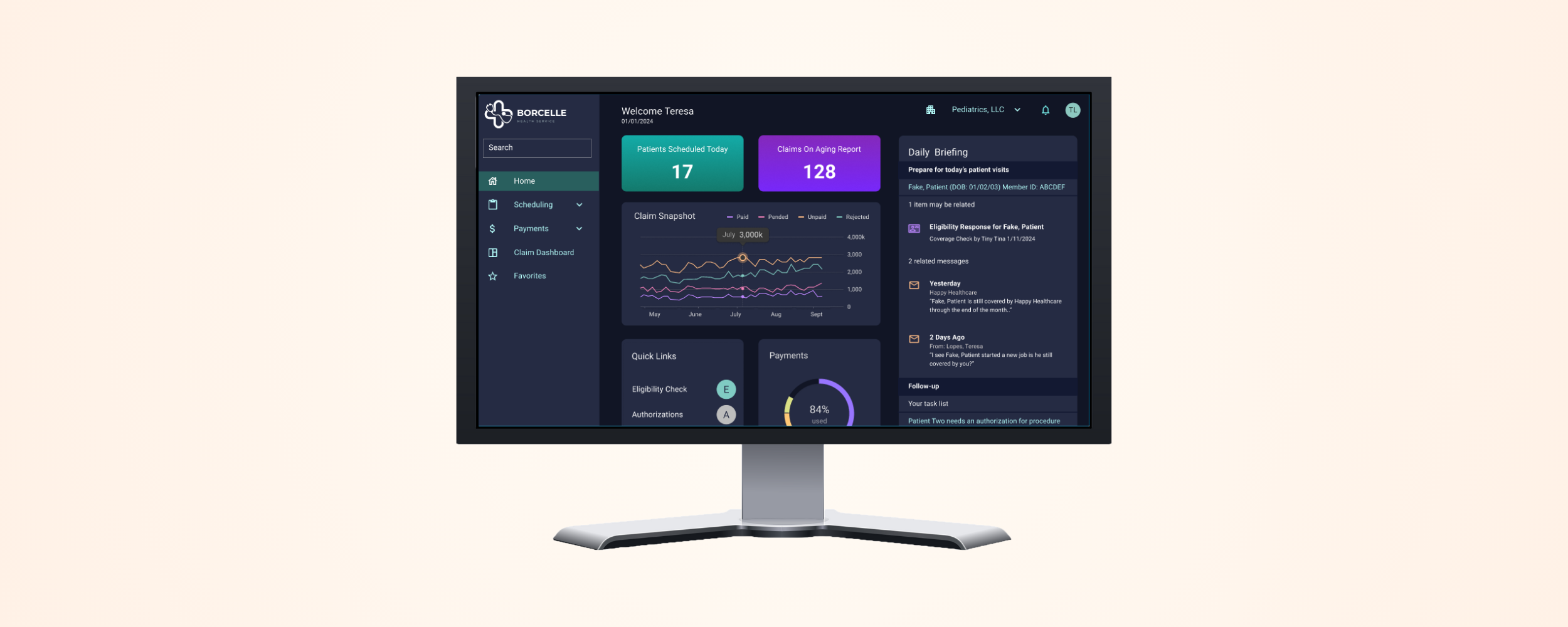
As a Senior UX Designer with over a decade of healthcare experience, I led a cross-functional team with minimal guidance to redesign a complex healthcare administration dashboard that served as the platform’s home screen—a critical hub for user communications and task management.
Timeframe: April–October 2020
Design a flexible, relevant, and user-personalized dashboard that streamlines communication and enhances productivity.
I conducted 30-minute remote interviews with administrators at large healthcare organizations and systems (>50 users) and unearthed the following pain points:
Key persona: IT-savvy admins in multi-provider clinics tasked with monitoring alerts, managing tasks, and reducing inefficiencies.

I facilitated stakeholder workshops to align on goals
I then built an affinity diagram and an inspiration catalog using Miro, identifying features like the ability to silence irrelevant alerts and AI-driven support.


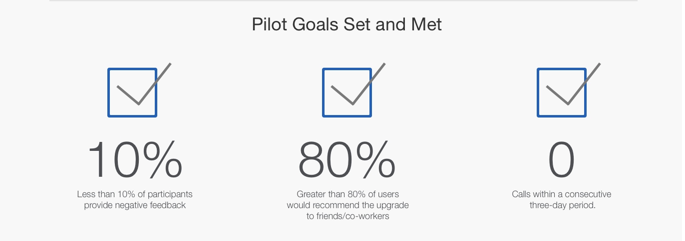
Complex healthcare workflows demand thoughtful UX with user-first defaults and gradual personalization. Ultimately, successful design isn’t just about flexibility—it’s about smart choices that serve both users and systems.